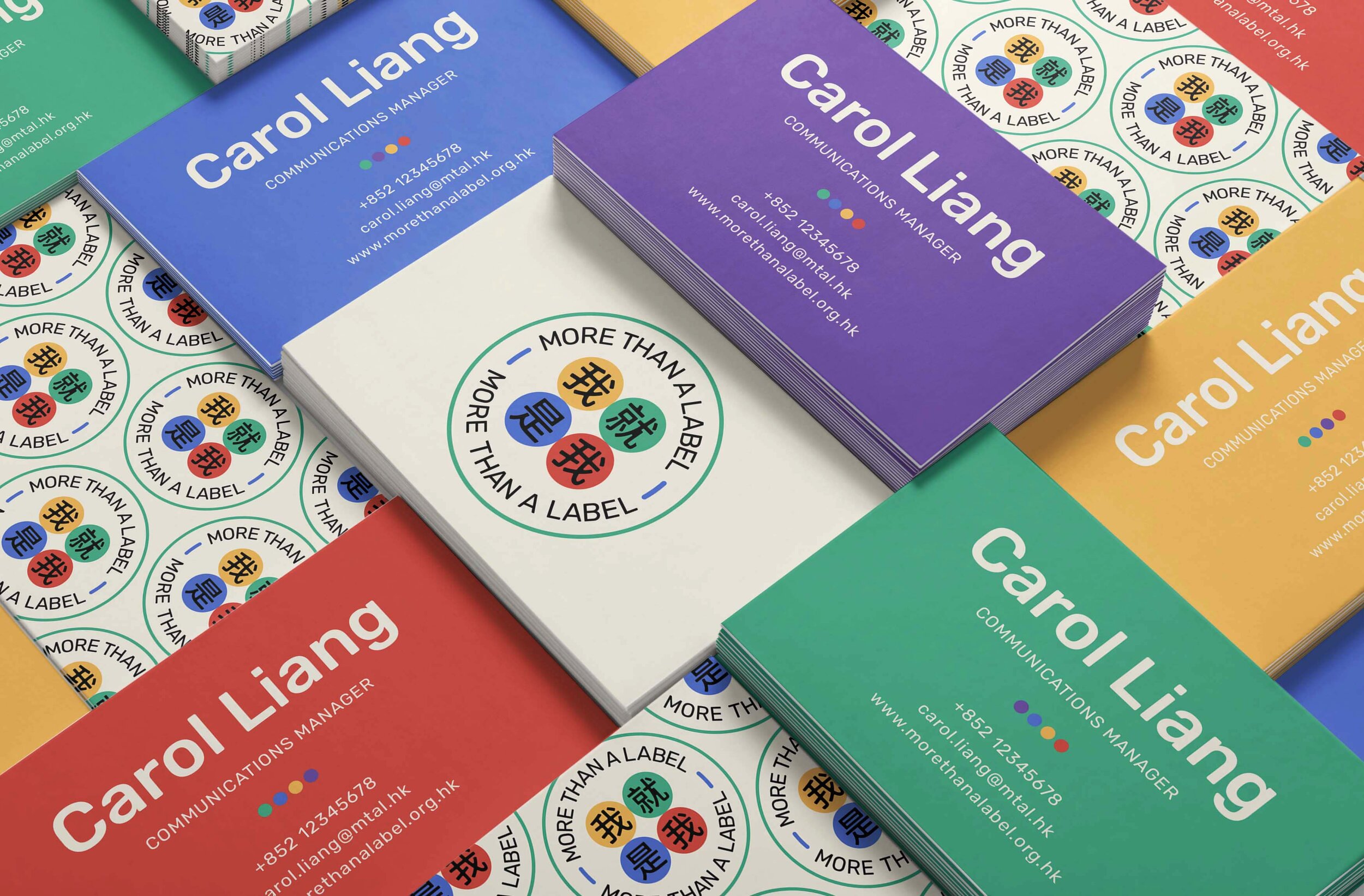
More Than A Label
A brand identity for Mind Hong Kong's anti-stigma campaign challenging perceptions of mental health diagnoses and encouraging the community to look beyond stigmatizing labels.
Brief: Create a balanced bilingual lockup where neither Chinese nor English text dominated, while ensuring the brand established a safe, inclusive visual language.
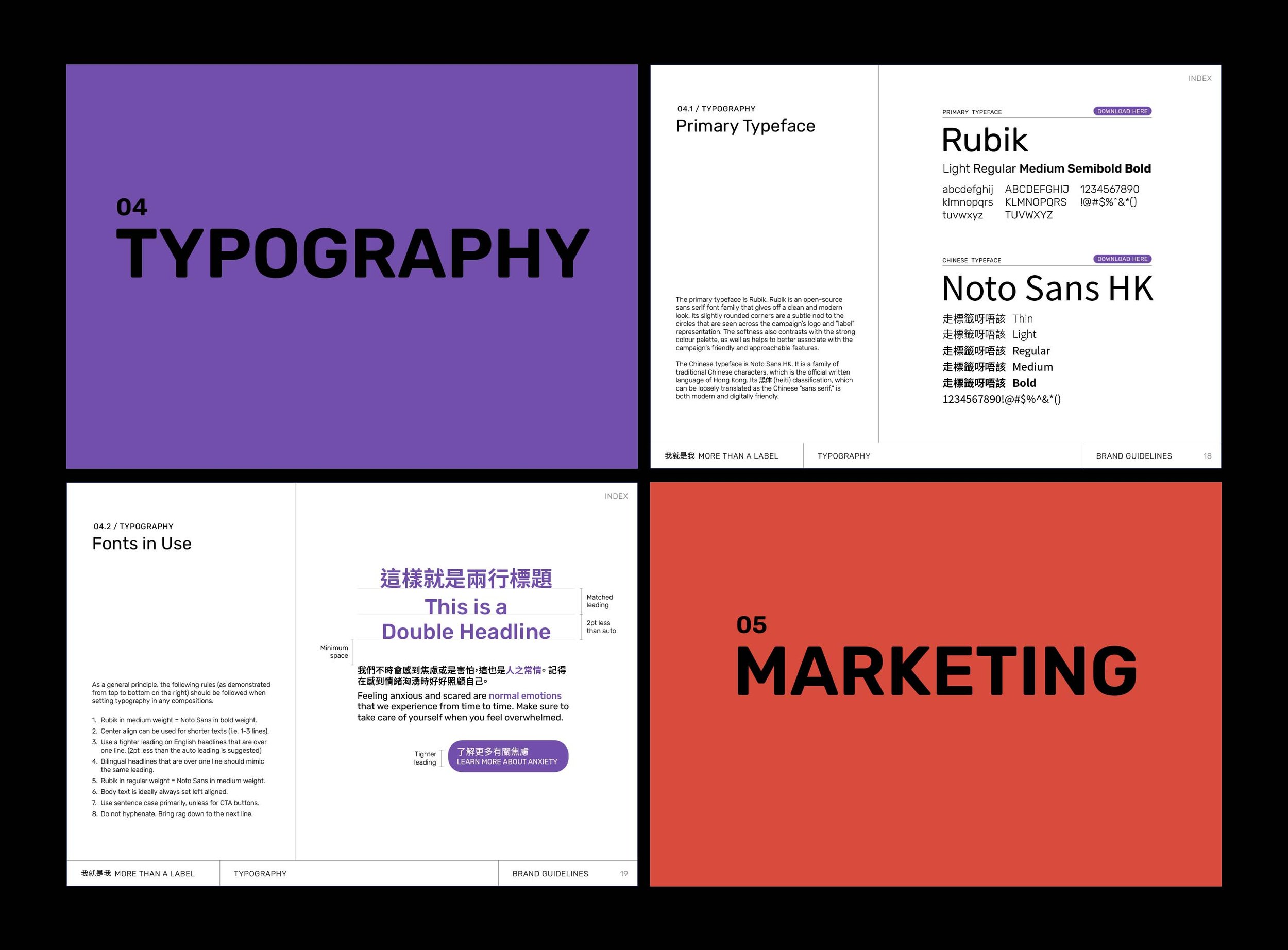
Beyond the required logo, color palette, and typography system, I developed an interactive guidelines deck and conceptual marketing materials including social media, print, and merchandise applications.
Year: 2021
Client
Mind Hong Kong – locally registered mental health charity working to change perceptions towards mental health conditions through storytelling, education, and community engagement.
Hats Worn
Brand Designer
Logo Designer
Deck Designer
Guidelines Designer